Laurentide Paint uses the world-renowned NCS Colour system, the number one colour tool for professionals.
This system ensures the highest colour quality on the market, with the most precise and reliable colour standards and sales/marketing tools.
Create your colour concepts using the NCS tool ecosystem. NCS design tools help you identify, define, and visualize your Laurentide Paint colour concept through a selection of digital and physical colour tools.
Thanks to this system, our customers can trust the final result.
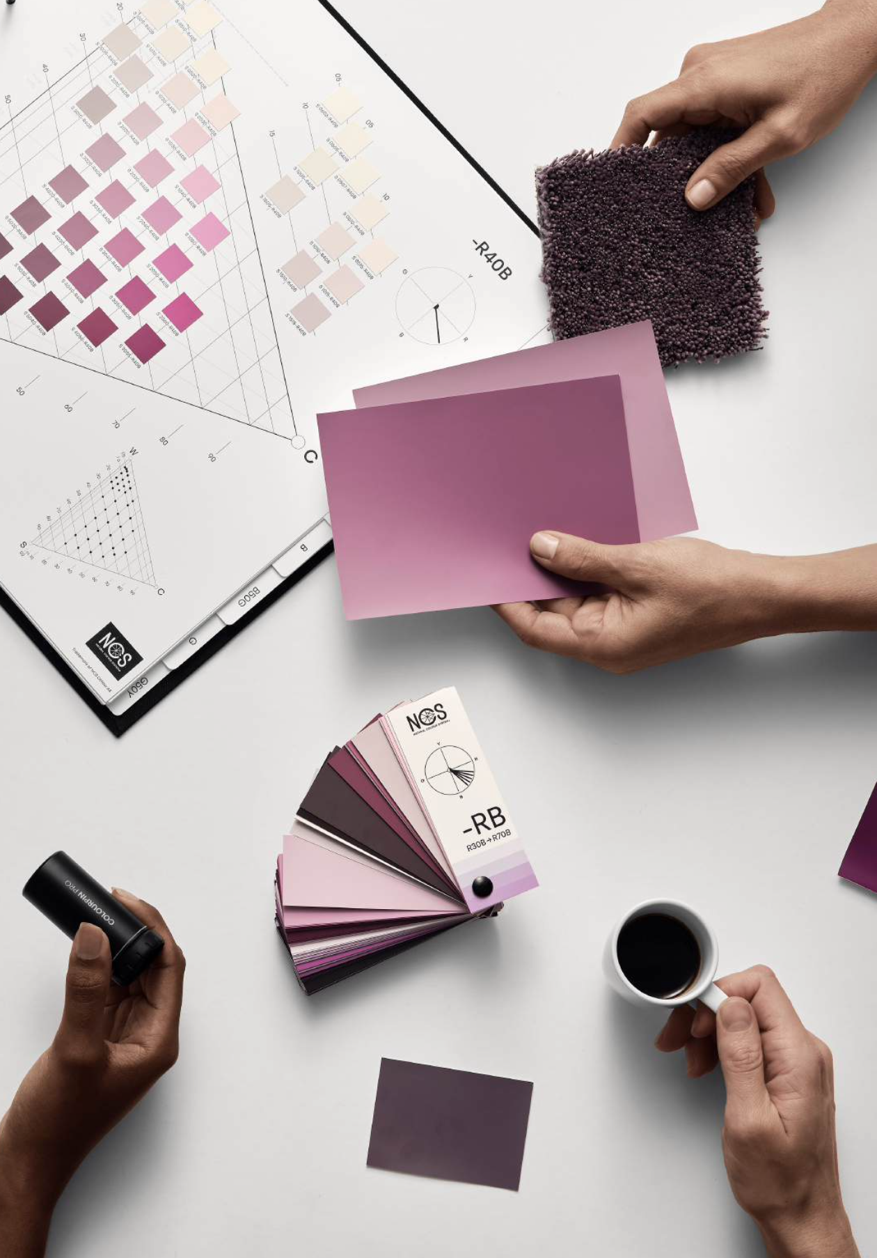
NCS Block Box : This is our complete collection of 2,050 colours in a pocket-sized format. Perfect for creating colour combinations or choosing materials, it’s available sorted either by nuance or by colour family.
Colourpin : Discover the NCS Colourpin, a handy tool if you want to find the exact colour of a decor item to help select your paint colour. Get the closest NCS notations, CMYK, RGB, and LAB conversions, and create mood boards to share with colleagues and clients.
Mobile App : The NCS+ app combined with the Colourpin lets you identify, pin, store, and share colours directly from your phone. Whether at the office or in-store, you can create perfect matches between textiles, accessories, furniture, and Laurentide Paint.
BONUS: The NCS+ app also offers tips and inspiration!
Contact us to learn more about our tools!
The study of colour trends reveals the dynamic relationship between culture, psychology and design.
Recognising that our homes serve as personal havens where we seek comfort and harmony, the significance of colours in influencing our well-being cannot be overstated.
We often hear that colours of past decades are back in fashion, but in fact, colour trends are a repetitive cycle of preferences. These preferences are shaped by external influences and the complexities of human psychology, as colours can evoke various emotions and affect the ambiance of a space.
NCS Interior Colour Trends 2025+ is a unique report on our colour preferences for the following years. The study is developed by international renowned colour experts, and the palettes are relevant for any market and country.
The study of Colours Beyond 2026+ reveals the dynamic relationship between culture, psychology and design. Recognizing that our homes serve as personal havens where we seek comfort and harmony, the significance of colours in influencing our well-being cannot be overstated.
We often hear that colours of past decades are back in fashion. In fact, colour preferences partially shift following a recurring cycle of preferences. These preferences are, however, also shaped by external influences and the complexities of human psychology, as colours can evoke various emotions and affect the ambiance of space.
NCS Interior Colours Beyond 2026+ is a unique study on our evolving colour preferences for the coming years. Developed by internationally renowned colour experts, the palettes are relevant across markets and cultures.
The 2026+ palettes are easy to embrace and welcome into our homes, reflecting a seamless blend of past influences and future-forward expressions.
Embodied Depth
A new chapter steeped in serenity begins! For 2026, Laurentide Paint unveils a rich, enveloping hue: Purple Garnet. A color with character, it embodies passion, intuition, and the quiet strength of a fully embraced transformation.
Nuanced with deep red, shadow, and warmth, Purple Garnet weaves a visceral connection between emotion, materiality, and elegance. It finds its place in bold interiors, reimagined heritage settings, or intimate spaces where one seeks to assert a strong, magnetic presence.
2026 promises to be a year of confident expression, considered boldness, and a return to what truly matters. Purple Garnet invites us to take a stand—to create spaces that comfort as much as they inspire, a return to the richness of pigments and their symbolic power.
The 2026 palette has a myriad of definitions and expressions. It communicates with confidence and shines through with authenticity.
The Quietude Space embodies an evolution of white moving away from minimalism to embrace a palette of soft, imperfect neutrals that soothe the senses.
The delicate shades of the Quietude Collection evoke the warmth of a cozy haven, the softness of golden light, and the perfect balance between tradition and modernity.
Each hue tells a story of peace, a soothing limestone white, welcoming neutral pinks, and a blue-gray that brings just the right touch of freshness.
A harmonious world where every detail breathes simplicity and elegance.